A website is the home base of any business, it’s time for you to use your home base to your advantage.
 Skip to content
Choosing your company’s colors is an important decision for any owner. These can be shown on your website and in your logo. They could be seen on gift bags, your shop sign, or your business card. The colors you select will affect how consumers view your brand and react when they visit your website.
Emotions evoked by colors impact behavior. To establish trust, the colors you choose for your brand must complement your company’s tone and messaging. Additionally, color can help people comprehend the information we are presenting and help them remember specifics.
Colors usually elicit subconscious reactions in humans. Because it’s a complicated science, it’s crucial to acquire professional (that’s us) guidance on the colors you should use on your website.
When it comes to choosing colors for web design, there is no right or wrong solution. The colors must elicit a behavioral response consistent with your brand’s culture and messaging.
Color can elicit an emotional reaction, promote brand loyalty, and even spur action. In design, color can be employed to motivate a call to action to be fulfilled. Understanding your intended audience will help you choose a color scheme that will work best for you.
The color of a brand is typically identifiable to us without further explanation. When confronted with rival products on a grocery store, it may encourage us to make a buy. When one sees purple, who doesn’t think of Cadbury? When one sees red, they don’t think of Coca-Cola. Maintaining a consistent color scheme throughout your company will boost customer loyalty and brand identification.
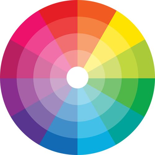
Since the middle of the 1600s, the color wheel has been used to represent the relationships between the twelve primary colors: red, blue, yellow, green, orange, violet, blue-green, yellow-green, red-orange, red-violet, and blue-violet.
Complementary colors complement each other effectively. These hues are excellent for evoking a sense of wisdom and serenity.
Complementary colors are those that are opposite one another. This is a wonderful option for a call to action button or to draw attention to crucial information because of the great contrast.
Triadic colors, which are uniformly distanced from one another, can also be grouped together.This may give off a lively, high-energy vibe.
Different client groups may associate different meanings with different colors. Purple, for instance, is more appealing to women and may even be harmful to men. In various nations, pink elicits diverse reactions.
The colors you choose should be influenced by your target market.
Three or four colors should make up the color scheme of your website. This will enable the design to highlight important details, make the content visually appealing, and create a lasting impression.
In order to create an aesthetically pleasing design that also elicits the desired behavioral reaction from the use of color, we discuss the traditional 60-30-10 guideline. This indicates that you should use 10% of an accent color, 30% of a secondary color, and 60% of the primary color.

Owner
info@chosemedia.com
